While designing Skyline Design’s page for viewing individual portfolio projects, I needed to add a feature that would enable users to close a description box in order to fully bask in the beauty of the designs being showcased.
While thinking of a solution, I recalled something similar I had seen on the SALT Branding web site. There’s an X in a red box on the top left corner of their content area which animates to show the word “close” when you hover over it.


View Demo
Salt’s site is all flash based, so the button was flash animated. I was tempted to Google a quick solution but on second thought, I decided I might as well be innovative if not original. Therefore, with a rough idea in mind, and with so much more coding to do, I decided that I would create a close button using SALT as inspiration.
The aim was to take the shortest route possible (if you aint heard, laziness is a virtue among coders) which meant writing the least amount of code in the least amount of time. No images, no flash, no JavaScript. Just CSS3.
The Concept
The sketch below shows how the button is to be put together.
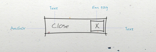
The Markup
<div id="demo-box"><a id="chips-funga" href="#">Close<em>X</em></a>
<!-- text can go here --></div>
As little html markup as possible! Of course, the code snippet above must be placed within the body tags in a document that has all the expected default code like a doctype and opening/closing html tags. The demo-box is also just housing our link, and is the container for text that should be hidden by clicking the close button. You could also use the html5 article tag instead of the chips-funga div, but for the sake of keeping the tutorial simple, let’s just use a div.
The Styling
With our markup in place, all we have to do now is style it exactly the way we want it to look. First, let’s style our container. We’ll put it in the middle of the page as shown in the demo.
/* The container */

#demo-box {
	width: 350px;
	height: 200px;
	background: #fff;
	position: relative; /* see NB below */
	margin: 100px auto 0;

	-webkit-box-shadow: 3px 3px 0 #ddd;
	-moz-box-shadow: 3px 3px 0 #ddd;
	box-shadow: 3px 3px 0 #ddd;
}
Again, we’re assuming that this CSS code is properly placed in the head of the document, whether within style tags or by being linked to an external style sheet (The latter should be used as much as possible).
Note that we have added
position:relativeto the container box.In CSS, if we want to precisely (absolutely) position an element B within a certain container A, we have to set A’s position to relative and B’s position to absolute. If we don’t, B will be placed absolutely in relation to the browser’s window.
Finally, we style our button. Watch it take shape as you add each line of CSS. Let’s start with styling the overall link:
a#chips-funga {
background: #c0eaf7;
color: #fff;
display: block;
font-size: 11px;
height: 16px;
line-height: 16px;
overflow: hidden;
position: absolute;
right: 7px;
text-indent: -9999px; /* hide "close" text */
top: 5px;
width: 16px;
z-index: 6;
}
Next, let’s style the “x” box:
a#chips-funga em {
background: #3cc1ea;
color: #fff;
display: inline-block;
float: right;
font-family: Tahoma, Geneva, sans-serif;
font-size: 8px;
font-style: normal;
height: 16px;
margin-left: 10px;
text-align: center;
text-indent: 0; /* override to show "x" */
width: 16px; /* same as a#chips-funga */
}
Now let’s determine how they’ll look when the user hovers over them:
a#chips-funga:hover {
padding-left: 10px;
text-indent: 0; /* override and show "close" text */
width: 60px; /* override width to show "close" */
}

a#chips-funga:hover em {
background: #209abf;
}
At this point, we have a functional button that opens to show the “close” text when we hover over it. This is as exciting as it gets if you use Internet Explorer (yea, even Microsoft hates IE). However, for those of us with modern browsers, we can add smooth transition effects that mimic JavaScript, enabling us to animate the opening and closing of the button.
So in summary, with the same xhtml markup that we started with, the following CSS (all combined) should give you the desired effect.
/* The container */

#demo-box {
width: 350px;
height: 200px;
background: #fff;
position: relative;
margin: 100px auto 0;

-webkit-box-shadow: 3px 3px 0 #ddd;
-moz-box-shadow: 3px 3px 0 #ddd;
border-box-shadow: 3px 3px 0 #ddd;
}

/* The close button */

a#chips-funga {
background: #c0eaf7;
color: #fff;
display: block;
font-size: 11px;
height: 16px;
line-height: 16px;
overflow: hidden;
position: absolute;
right: 7px;
text-indent: -9999px;
top: 5px;
width: 16px;
z-index: 6;

-webkit-transition: all 0.5s ease-in;
-moz-transition: all 0.5s ease-in;
-webkit-border-radius: 8px;
-moz-border-radius: 8px;
border-radius: 8px
}

a#chips-funga em {
background: #3cc1ea;
color: #fff;
display: inline-block;
float: right;
font-family: Tahoma, Geneva, sans-serif;
font-size: 8px;
font-style: normal;
height: 16px;
margin-left: 10px;
text-align: center;
text-indent: 0;
width: 16px;

-webkit-border-radius: 8px;
-moz-border-radius: 8px;
border-radius: 8px
}

/* Hover states */

a#chips-funga:hover {
padding-left: 10px;
text-indent: 0;
width: 60px
}

a#chips-funga:hover em {
background: #209abf;

-webkit-border-top-left-radius: 0;
-webkit-border-bottom-left-radius: 0;
-moz-border-radius-topleft: 0;
-moz-border-radius-bottomleft: 0
}
Summary
And that’s it! We have a nice animated close button within minutes. Now all you have to do is control how the hiding will happen with JavaScript, which is another tutorial in itself. Check out the demo, and we’d be glad if you could share this resource. Happy coding!