Well, I hope y’all had a merry Christmas. 2011 is now upon us, and among the things I am excited about is Flame’s first time visit to Africa! Flame is a renown gospel rap artiste from the US. I am a big fan, and seeing that Kenya will be the first African country he’ll be visiting, I thought I might design a poster for the event on 9th January and share the tutorial with you. Here’s a littlebackground of FLAME on his web site and his latest album on iTunes.
Alright, let’s dig in! Posters for events have become monotonous and predictable lately. For this particular one, I wanted to include very few details. I also wanted to take a different approach coz almost everyone takes the “hype” road. Well, I decided to take the “sentimental” approach. I mean, let’s face it, FLAME is from Africa. He’s just coming back! Furthermore, he’s not coming to strangers but to brothers and sisters. The believers know what am talking about. Paul expressed it in Romans 1:11-12.
Alright, enough ado. Let’s get into this!
 First of all, we need Flame’s photo. There’s many of them out there, but I found a “sentimental” one at this link, courtesy of The Southern Baptist Theological Seminary web site.
It’s easy to just grab images from Google, but remember never to use images from the internet without permissions from the owner or without giving credit where it’s due.
Okay. Now that we have our image, let’s boot up Photoshop. I am using CS4, but it should be easy for you to follow along with whatever version. Now drag Flame’s photo into Photoshop. You should have something like this:
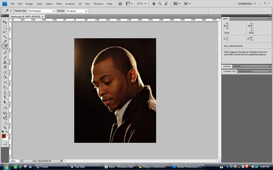
Flame's photo in Photoshop
Now, I know I’m calling this a poster, but it’s not for print. You can follow the same steps to design one for print (you’d only have to change the mode from RGB to CMYK), but I had a facebook campaign in mind instead. First is because the image I liked wasn’t in high resolution. Secondly, at the time of writing, Flame is probably on his flight already! Cool. So if we are designing for facebook, we’ll use the image’s natural height and facebook’s maximum image width – 720px.
Click on the layer palette to see the layers. You’ll find only one, called Background. It has Flame’s image. Double click it to unlock it and turn it into a normal layer. Call the layer “flame”. Then, press Shift + Ctrl + N (am working in windows) to create a new layer. Call it “bg”. Drag that layer to be below “flame” in the layers palette.
Now, in order for us to get our poster size, we’ll play around with the canvas. Go to Image » Canvas Size in the menu, or Press Alt + Ctrl + C. This opens up a dialog box where we can edit our canvas. Now, we want Flame’s image to be at the extreme right and our canvas to be 720px. Use the following settings:
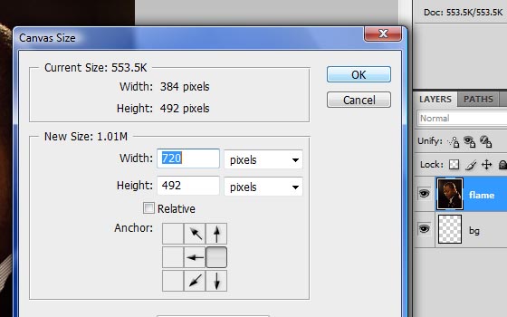
Adjusting canvas size
We should have something like this:
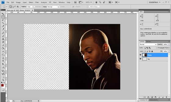
Canvas ready
The “bg” layer we had created now comes in handy. We’ll fill it with a background color. We’ll use the Eyedropper Tool to sample a color from Flame’s image so they can blend. Press I to select the tool. Now pick a color from the area behind Flame’s neck. I used #0b0603.
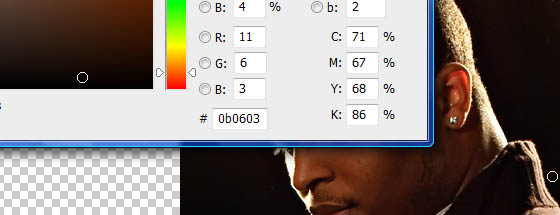
bg Color
Now select the bg layer by clicking on it in the Layers palette. Next, select the Paint Bucket tool by pressing G. Click into the layer to fill it with the color we had selected.
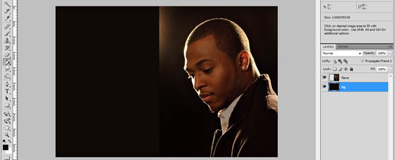
bg Filled
Good. Now we need to blend Flame’s image with the background. We’ll do that by erasing around Flame with a soft brush. Because his image is above the background, the two will blend.
Select the Eraser Tool by pressing E. I used the default 300px brush shown below:
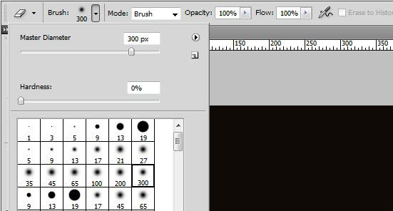
The erasing brush
Make sure that the layer “flame” is selected. Use the brush to erase the image around Flame, being careful to keep a small distance and not touch him. You’ll see the unwanted parts of the image disappear and the background color show through! From here, we have plenty of space to turn the image into anything we want!
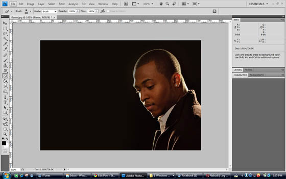
Ready for info
OK. It’s about time we added some text. One of my favorite fonts is Planet of the Apes, and that’s what we’ll be using. It’s big and bold. You can download your own copy and install it (right click the downloaded file and select Install).
Create a new layer above Flame’s image.
Select the Horizontal Type Tool by clicking it or pressing T. Make the foreground color white by pressing D then X. If black is in front, press X again to bring up white. In the options bar at the top, select the Planet of the Apes font from the list. Using font size 86px and with caps lock on, type the word FLAME. Using the arrow keys, move the text to the top right corner, ensuring that it is 3 pixels from both the top and right edges. Now double-click the layer (which should now be automatically labelled FLAME) and apply the following settings:
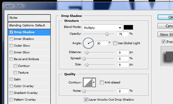
Drop shadow for text
And that should give you…
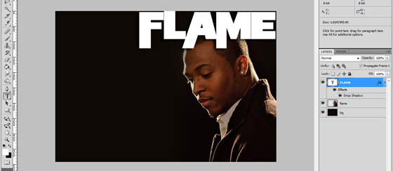
Main text added
Next, we’ll add the circle that should be behind the date. We want it to be the height of the “F” in FLAME. So we’ll use guides to do this. Make sure your rulers are visible. If they aren’t press Ctrl + R. Now click on the top ruler and drag your mouse to the upper edge of the word FLAME and release the mouse. Repeat this and this time set the guide to the lower edge of the word. Now select the Ellipse Tool. It is under the Rectangle Tool, so click and hold the Rectangle Tool in the toolbar with your mouse until the hidden tools are revealed. Select the Ellipse tool. Now hold down the Shift key and with your mouse, draw a circle from the top guide to the bottom guide. You should end up with something like:
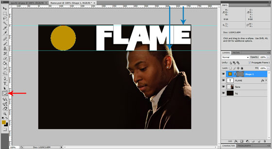
Ellipse drawn
You might have a problem setting the top guide. It helps to do this when you have zoomed in by pressing Ctrl and the + button. Press Ctrl plus the – button to zoom out once you are done. You can show or hide guides by pressing Ctrl + ;
We’d like the circle to be black, so double click the layer that contains it to bring up the effects dialog box. Under Color Overlay, click the red box and select the black color on the bottom left or bottom right of the color box that pops up. Rename the layer to “circle” (You do this by double-clicking the label “Shape 1”)
As you can see, if you are following along, there is very little contrast between the black circle and the dark brown background. We’d like to add a lighter background behind it. This would be a perfect time to add some grunge effects, but remember we are going for a soft, sentimental design.
We’ll use a brush to accomplish this, so first create a new layer (Shift + Ctrl + N). Rename it to Circle bg and drag it to be immediately under the Circle layer
Now select the Brush Tool in the toolbar or press B. Open up the brush menu in the options bar at the top and select brush 23 (I think it’s one of the default ones). Any rough brush will do though. Adjust the brush size to 195px.
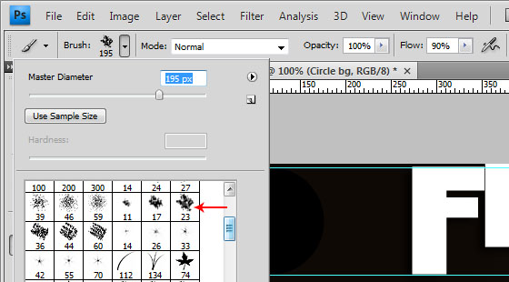
Brush and settings
Set the foreground color to #e59343 and with the “Circle bg” layer selected, click two or three times behind the circle with your brush. This is what I have.
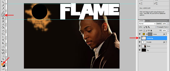
Circle background added
Now let’s turn that into a soft effect. On the main menu, go to Filter » Blur… » Gaussian Blur… and set the radius to 14 pixels. Now in the layers palette, change the opacity of the Circle bg layer to 40% (type it in or drag the slider to the left). We now have this.
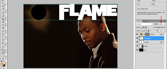
Nice n soft highlight
Great! Now let’s add some more text. We’ll put the date of the event on top of the circle. Since we’ve already used a blocked font, we’ll complement it with a more elegant font. We’ll use Edwardian Script ITC. I think it comes packaged with Windows. If you dont have it, any calligraphic font will do.
Create a new layer and change the foreground color to a bright green. You can use #b7cf14. Ensure that the new layer is the uppermost in the layers palette. Now type 9.1.2011 with a font size of 30px and change the type resolution to Strong. You should have this:
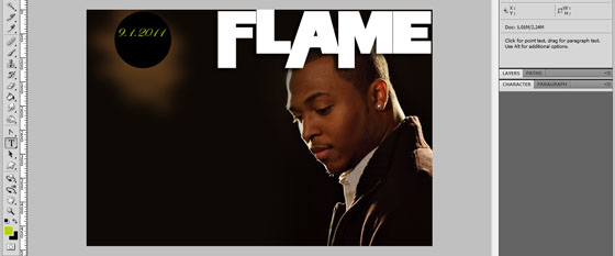
Date added
Now we’ll add the defining theme of our poster, “Back to Africa”. Create another new layer and change the font back to Planet of the Apes and set the font size to 27px. Set the foreground color to #8e7346.
You may wonder where I am getting these color values. One of the things you’ll find very helpful when working with designs like these is to sample colors from the original photo. That way, they’ll always match. I picked the color from his shirt’s collar!
Type the words “bAck to Africa”. It should stretch out to the L in FLAME. Create a new layer and ensure that it is below the text you’ve just typed. Select the Rectangle Tool, set the foreground color to black and draw a background behind the text. Set the opacity of this layer to 80%. You should have something like this:
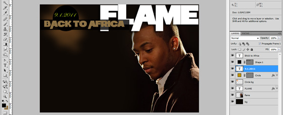
Theme with semi-transparent background
Now for some awesome addition. We are going to add a world map and fade the other continents, leaving Africa prominently at the center. We’ll be using a custom shape freebie, so grab yours from ~lukeroberts on deviantART. Unzip the zip file you’ve just downloaded and double-click the file labelled “World Map – updated”. This will automatically load the custom shape in Photoshop.
Select the Custom Shape Tool (it’s the last option under the Rectangle Tool) and in the options bar at the top of the window, select the full world map custom shape. Create a new layer and drag it to be under Flame’s photo (labelled flame). Then, also drag the Circle bg to be directly above the bg layer. Now with your new layer selected (the one below Flame’s photo), hold the Shift key (to maintain proportions) and drag the mouse to create the world map, making it stretch from the top to the bottom.
Double click the layer and in the color overlay option, set the color to the same color as the “bAck to Africa” title. You can do this by clicking the red box and then clicking inside the title in your document to sample the color. You should now have the following setup:
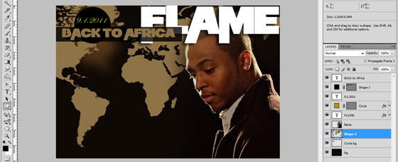
World map added
We want to get rid of the continents on the left to reduce noise in the design, so grab the Eraser tool. It should still be the soft 300px brush. Now, we cant just erase the map directly because it is a vector and it has effects applied to it. Therefore we need to do what we call “Rasterizing”, which converts it from vector to bitmap.
To do this, right click the World Map layer and select “Convert to Smart Object”. Right click it again and select “Rasterize Layer”. We can now erase it. Steer clear of Africa as you do so (haha!), and leave just a little bit of the upper part of North America behind the black circle. This is the expected result:
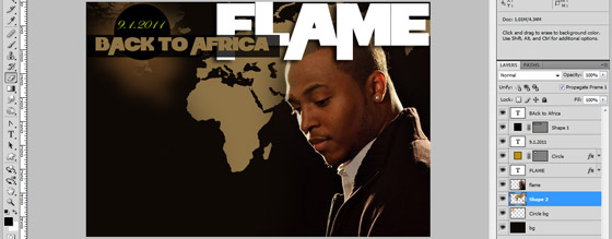
Erased
We are almost done! All we have to do now is add the event information.
Right click the “circle” layer and select “Duplicate Layer”. Of course, this will create a duplicate of the circle. Then, press Ctrl + T to bring up the transform options. In the options bar at the top, set the width and height of the duplicated circle to 150% and hit Enter. Now select the Move Tool (or press V) and move the larger circle adjacent to the African continent. Repeat the duplication and enlargement process using this larger circle as your starter figure. Drag the third circle to be directly under the African continent, showing only it’s upper third.
You should have this:
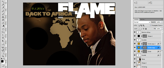
3 matching, proportionate circles
Dulpicate the Circle bg layer and drag it under the second circle (with the Move Tool). Go to Filter » Gaussian Blur…
Duplicate that layer and drag it under the last circle with the edges just showing. Again, go to Filter » Gaussian Blur…
Result?
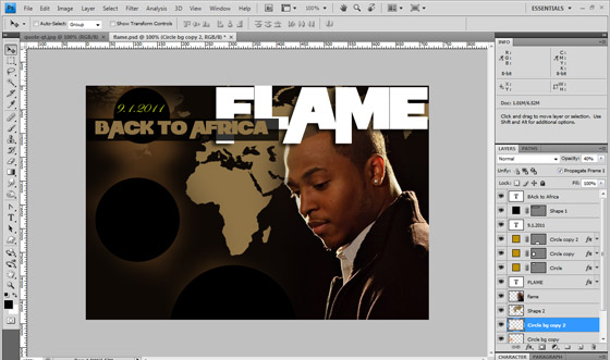
with highlights
Now you can add the info concerning the concert, dates, sponsors, your logo, anything you want! I challenge you to take it from here and see what you can do with it.
This was my final result, which you are well capable of achieving:
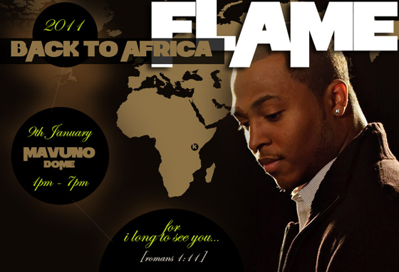
Final Poster!
Whew! And that marks the start of a promising year! You can download the PSD file for this tutorial below so you can play around with it.