This morning, the most unexpected of things happened, I was taught a lesson in user experience by the packaging of a loaf of bread. Yeah, I was as surprised as you are!
Bread Packaging 1 – Strip of white adhesive tape
All the loaves of bread I’ve encountered are usually sealed using a strip of white adhesive tape with the expiry date printed on it, as shown below.

Loaf of bread sealed with a strip of white adhesive
From the manufacturer’s perspective, this is a way of killing two birds with one stone – sealing the loaf of bread and communicating the expiry date to the user – all with a small strip of adhesive tape. From the consumer’s perspective(the user) though, there were a few problems:
- Opening the loaf of bread is a cumbersome exercise involving removing adhesive tape that’s stuck on a plastic bag – not as easy as you think.
- The tape is not easily re-usable in re-sealing the packaging, but this could easily be fixed by tying a simple knot using the packaging plastic bag.
- Losing that white adhesive strip meant that, coming back a day later, you would not know when the loaf of bread would expire.
- Sometimes, as in the photo above, the strip could be damaged before purchase thus not showing the expiry date.
Bread Packaging 2 – Strip of malleable plastic
Then today I saw this new kind of packaging, instead of the strip of adhesive, there was a plain white piece of malleable plastic and the expiry date was printed on the packaging.
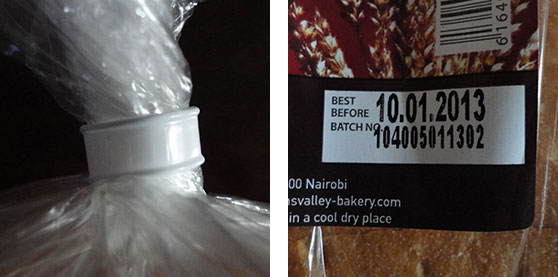
Loaf of bread sealed with a flexible, re-usable piece of plastic
From the consumer’s perspective, this packaging had several advantages:
- Opening the loaf of bread is very easy – you simply unwind the malleable piece of plastic.
- Re-sealing the packaging is easy since the piece of plastic was re-usable.
- You could always know the expiry date, at any time, irregardless of how the loaf of bread was sealed.
Why I was impressed
Most of us open a loaf of bread almost daily…so often, that we barely take note of the packaging. The packaging and the pain-points of “Bread 1” are so trivial thing that we couldn’t care less as long as we have our loaf of bread.
This is precisely what impressed me even more about “Bread 2”. The bakery took their time to solve a problem I did not think I had. For me buying a loaf of bread involved simply picking out the closest, freshest-looking one off the shelf but now, “Bread 2” have me converted…I will be looking out for their brand instead.
It’s the little things that count
As developers and designers, we tend to forget about who we should focus on when designing a website or web application. We often stress about the how to accomplish a certain task when we could easily get the answer by thinking about what is best for the user.
Two web applications could do the same thing, e.g. send e-mail, but it is those tiny little details (like reminding a user to add an attachment) that set them apart, thereby defining which one retains a user and which one does not. So the next time you have a decision to make about a feature you are developing, always think about what the user needs and how you could make their life easier.
It is always impressive to over-deliver on the user’s expectations.
If you like this post, you could also discuss/up-vote it on Hacker News