It’s like 2am in the morning and I can’t fall asleep because my sleep pattern’s been kinda messed up with all this overnight coding I’ve been doing lately. So guess what? I’ve been digging up info on branding in the political spheres and I’ve come across some very intriguing articles. Keeping in mind that Kenya will be electing a new president in 2012 too, I decided to check out what American politicians were doing to position themselves on the web.
In Kenya, a web site and brand is often an afterthought. A “by the way” kind of thing. But believe me, Obama would tell you that it’s not only not an afterthought, it is crucial, essential, and imperative in a campaign.
I must say, however, that I was surprised to find some very bland sites as I went through the candidates one by one. Some of them have, in the words of Mark Zuckerberg, “pretty horrendous” web sites. There’s a few good ones though, and I hope our serious Kenyan politicians can find a leaf to borrow.
Before we see them, I noted one thing that was common in about 80% of these web sites. They all displayed a splash page asking for a signup before you could go to the main site. Here’s an example that’s typical:
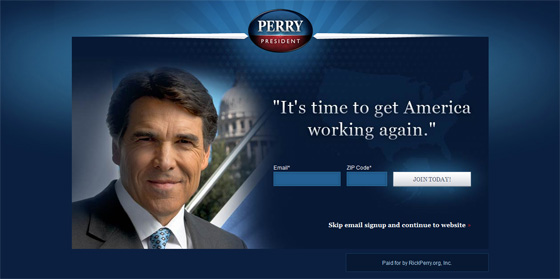
A typical layout for the splash pages
Update
Note the subtle, subliminal effect of the white house showing behind Perry! It’s like he is presenting himself with the authority it commands while helping you envision him there.
These splash pages are very strategic. It’s like getting as many virtual votes and followers as possible before the actual voting day. Getting the site’s visitors to do something while they’re on the site is important, instead of just making them feel like “Oh yeah, he/she says this and that. Good to know!”
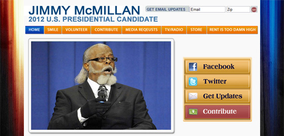
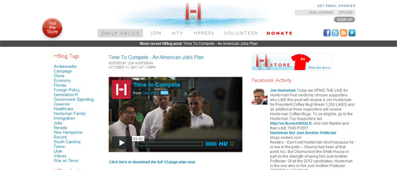
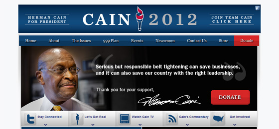
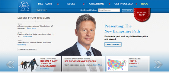
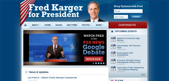
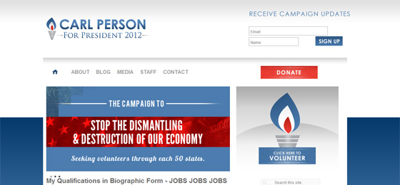
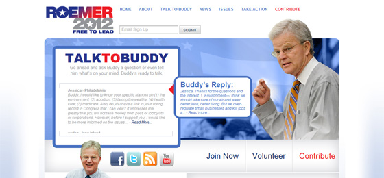
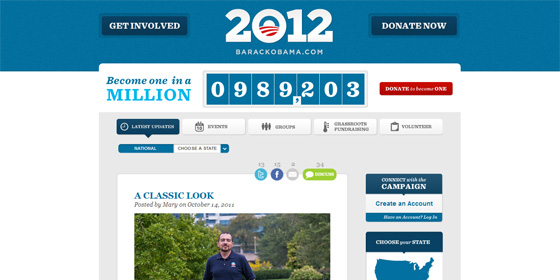
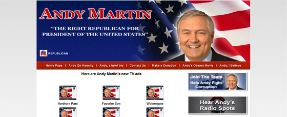
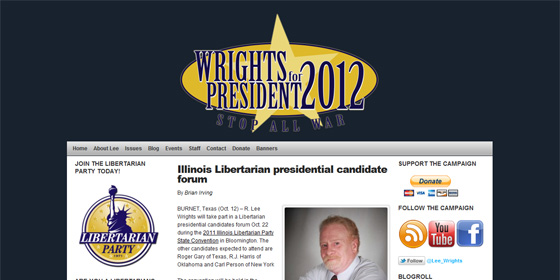
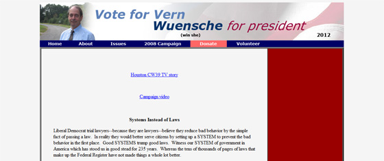
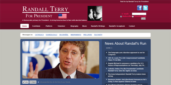
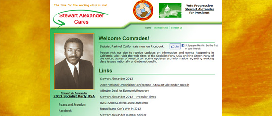
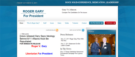
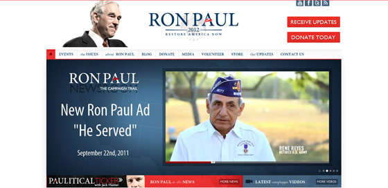
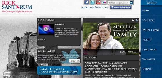
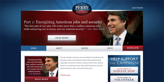
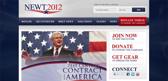
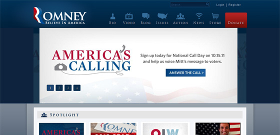
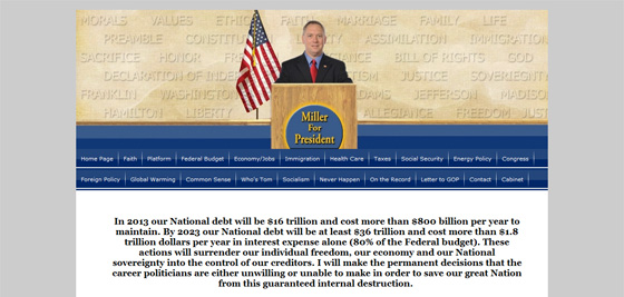
So here are their web sites, in no particular order of awesomeness (or lack thereof):
That last one… hehehe! Good luck to him, that’s really funny! Haha!
And on that note, let’s hope that we’ll see some serious Kenyan web sites as the election year quickly approaches.
A brand is a gut feeling. You cannot control it; you can only influence it.
– Marty Neumeier
