Any designer who’s serious about his job takes time to study color theory, even if he only goes ankle deep. It’s indispensable to know that yellow gives a sense of cheerfulness, blue evokes a sense of calm, purple is associated with royalty, and you should never use red if you decide to waste your time taking part in some pointless nuclear energy logo competition.
However, I was forced to question the interpretation of a certain color: green. Almost anyone you ask will tell you that money is represented by the color green. It’s been drilled into us so much that we don’t even afford it a second thought.
Right now, we’re in the process of drafting an agreement to redesign the web site of a certain financial institution. So far, the creative aspect is up to us, but one thing was made very clear and non-negotiable; you must use shades of green. The moment I read that, the rebellious bad old Huston rose up with the question “why?”. I began to question why financial institutions insist on green. Sure, the one who gave me the condition was a professional graphic designer who was in the process of finalizing a solid brand for the organization, but I still couldn’t shake off the question.
The answer, as you’ll see below, is quite simple.
If green represents money, then it only makes sense that we take a look at the mulla, right?
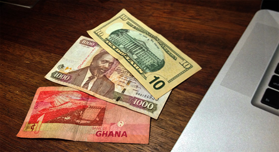
A photo I took of some home grown shillings, some Benjies, and legal tender from Africa’s chocolate haven.
Need I say more?
It’s nothing deep, really. Americans write a lot about design (thank God for that) → their printed currency is primarily green → they associate green with money → they write about it → we read it and say a big religious amen!
Then we write brand guidelines based on that.
Shouldn’t someone question it all?